Showing posts with label Cathy Miles. Show all posts

Wednesday, June 26, 2013

How to use a focal print as background


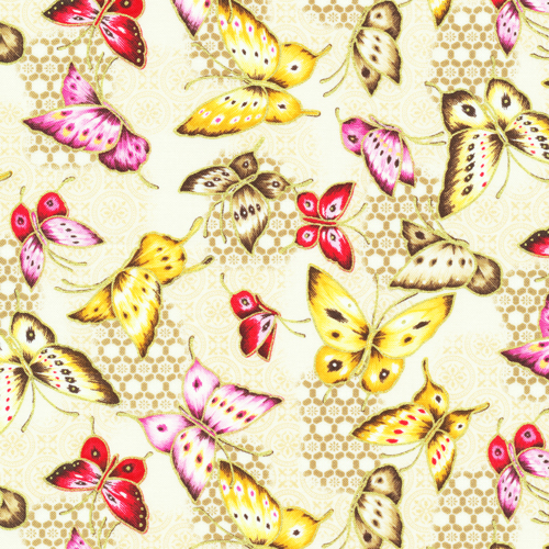
When Cathy Miles created her "Asian Garden" quilt (using our fabric line of the same name), she chose to highlight the coordinating tonal prints, reserving one of the allover prints (butterflies!) for the background of the pieced blocks. 
"Asian Garden" by Cathy Miles;
featured in Quilt magazine, August-September 2013 issue

We love the result! What do you think? 
Read what Cathy has to say about her quilt design, which reminds her of Chinese lanterns.

Q. What attracted you to the Asian Garden fabrics?
Cathy: There is good contrast between the various fabrics, and I seem to be drawn to designs that have a definite light/medium/dark palette so the design of the blocks really shows. But really, butterflies! Who can resist?

Q. What are the two blocks you used, and why did you decide to pair them?
Cathy: The mostly purple one is Aunt Dinah and the pink one is Lucky Clover. I like the strong chain effect that surfaces when the blocks are alternated. I experimented with different ways to use the fabrics, but the final one reminded me of strings of Chinese lanterns.
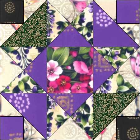
Aunt Dinah block

Lucky Clover block

Q. Why did you decide to make the pink, green and purple prominent in the design?
Cathy: Green and purple has been a favorite duo of mine for years, it reminds me of spring with lilacs, pansies, hyacinths, all those great blossoms that tell us spring is here. Adding the pink in this one made a riot of color that played well with the background butterflies.

Q. How do you think that busier design of the butterfly print in the background enhances the quilt?
Cathy: I think the print used as background softens the effect of the strong colors.

Q. What do you like best about the quilt?
Cathy: This one turned into a more personal design than expected. We visited Butchart Gardens (located in Brentwood Bay, British Columbia) and the nearby butterfly garden with my parents several years ago, and I was reminded of the masses of flowers and beautiful Vancouver with hanging baskets along the sidewalks.

Q. Were there challenges to designing/making this quilt?
Cathy: Trying to achieve a good balance with strong colors was a challenge. I wanted to avoid having one color dominate the quilt.

Q. What do you enjoy most about quilting? 
Cathy: I have such great fun with quilting! If my 'play' has become 'work,' it is all good. 
My husband has also been very helpful and supportive of my projects, so it is fun for both of us. He is involved with hanging quilt shows and taking care of the racks, which was a big job last year when there was a fire in the storage area. He hand sanded every piece because he knew it was important to eliminate any possibility of soot staining the quilts or having a quilt show that smelled like smoke. He always finds someone to chat with as we visit various shops. I think he has been surprised at the number of men he meets who also support their wives in various ways.

Find the kit for "Asian Garden" here.
See the entire Asian Garden fabric collection here.
Find Quilt magazine here. 


Friday, April 19, 2013

Not Your Average Punch & Judy


When you hear "Punch & Judy" do you think of this?

Image: http://www.telegraph.co.uk/sponsored/in-the-know/london-entertainment/9687460/punch-and-judy-show-london.html

Cathy Miles has a slightly less traditional take on Punch & Judy.
"Punch & Judy" by Cathy Miles
Image: Fons & Porter

We love the patchwork look of her bright, summery quilt, made from the Marblehead Global Brights and featured in the Summer 2013 issue of Fons & Porter's Easy Quilts. Where did the name for this quilt come from? Keep reading; Cathy will tell you! 

Q. How did you come up with the design?
Cathy: Sister's Choice is a favorite block pattern of mine; I like the nine-patch center paired with the 'almost a star' effect of the points, and when they are alternated with a simple block, such as the 25-patch, there is a strong diagonal effect. I like the movement it creates, so there is interest horizontally, vertically, as well as on both diagonals.

Q. How did you come up with the name for this quilt?
Cathy: The colors in this group are irresistible! Tart lemons, tangy limes, ripe raspberries, plus a few blueberries, looked like fruit punch to me! And I have a sister named Judy. When naming quilts, I often give a nod to family and other special interests.

Q. What is your favorite thing about the Marblehead Global Brights?
Cathy: This collection has mottled and shaded bright fabrics, which lend interest to the fabrics. While the design would work well with solids, these fabrics create an effect similar to batiks, which gives some depth to the colors.

Q. What did you do differently on this quilt from your usual designs?
Cathy: I usually add a border to frame the pieced center, but this one stands on its own. I just used a lime green binding to finish. That is a different effect and since it is a good size for a throw, it didn't seem necessary to make it bigger.

Q. What prompted you to design Punch & Judy?
Cathy: I was playing with the fabric colors in EQ6 and I liked the way this one turned out. The bonus is that digital designs always look better in fabric.

Q. Give us your vision for using this quilt.
Cathy: This is a throw that would brighten a guest room, especially on a bed 'dressed' Euro style with white sheets and duvet.

Q. Any special machine quilting tricks?
Cathy: I used my favorite shaded kiwi green to quilt this one, and it is surprising how it blends with the other colors in the quilt since the green is actually the fabric used the least. The design is a freehand swirl, that I use a lot, because it fills the space fairly evenly and moves along fairly quickly!


See the entire Marblehead Global Brights collection here.
Find the magazine here.
Find the kit here. 


Monday, April 15, 2013

The Zen of Black and White


There's a magic (zen-fullness?) to black and white. It's both classic and trendy, both chic and simple. 

Cathy Miles used our Black and White collection to make this little beauty, featured in Simple Quilts & Sewing magazine. What a great design, and so easy too! We asked her to share a bit about the design process with us, and she did!
"Black Tie Affair" by Cathy Miles
featured in Simple Quilts & Sewing magazine Spring 2013

Q. How did you come up with the design?
Cathy: This elegant fabric reminded me of formal attire, so it was a natural for bow tie blocks. I shifted them around until I liked the effect.

Q. What attracted you to the fabrics?
Cathy: I am usually drawn to bright colors & lots of them, so I was surprised at the appeal of this black & white group. It is frosted with pearl and the artwork is really something special.

Q. What is your favorite print from the collection?
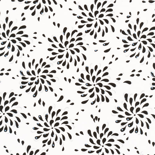
Cathy: It's hard to choose a favorite. I like the teardrop-shaped black bits on white, but the random white drops with strings of pearls on black is also very appealing, and the large print that is on the back is worthy of a frame to hang on the wall. I know I already mentioned the glisten of pearls on the fabric, but we see a lot of gold accent on fabrics these days and the pearl effect is a much more subtle way to add interest to the fabric.


Q. What do you like best about the quilt?
Cathy: It reminds me of men in tuxedos & white dinner jackets- like those great classic movies with stars like Cary Grant & Bette Davis.

Blog editor's note: So more like this...
Image: www.weddingplanninginstitute.com

and not so much like this!
Image: www.inknburn.com

Q. What prompted you to design the quilt?
Cathy: Some days I just feel like whacking into great fabric and doing something that is finished quickly- this was a project completed on a rainy Sunday.

Q. What do you envision it being used for?
Cathy: Beyond gracing a table or buffet, it could be used for a dresser scarf, or an accent piece across the back of a chair or couch.

Q. Can you talk about the machine quilting?
Cathy: I free motion quilted it on my home machine. I wanted to keep it simple and let the bow ties dominate, so I used black thread. I did avoid quilting in the white spaces, and those were small enough that just quilting through the black pieces was enough for the kind of use this runner will have.


The editors of Simple Quilts & Sewing included a great tip--since black and white go with everything, consider using a "surprise pop of color" for the backing or binding!

See the entire Black and white collection here.
Find the kit for this project at Canton Village Quilt Works.
Find Simple Quilts & Sewing here.

p.s. If this fabric line looks familiar, that's because it's also being used in the Maine Shop Hop, running all through the month of April. Find out more here.