Last week we told you about our Mad for Solids bracket...today it begins!
We've asked 16 quilters to pick their own 8-color bundle from our Painter's Palette Solids collection. Through a random drawing, we've sorted those bundles into a bracket, March Madness-style, and these designers' bundles will be competing against each other over the next two weeks to help name the "Best Bundle."
Here's our bracket, and then below you'll find images of each designer's bundle (plus SKUs so you can find the colors you like best at a shop near you). Voting will start in a separate post. Enjoy all of these gorgeous palettes!
 |
| Click on bracket to enlarge |
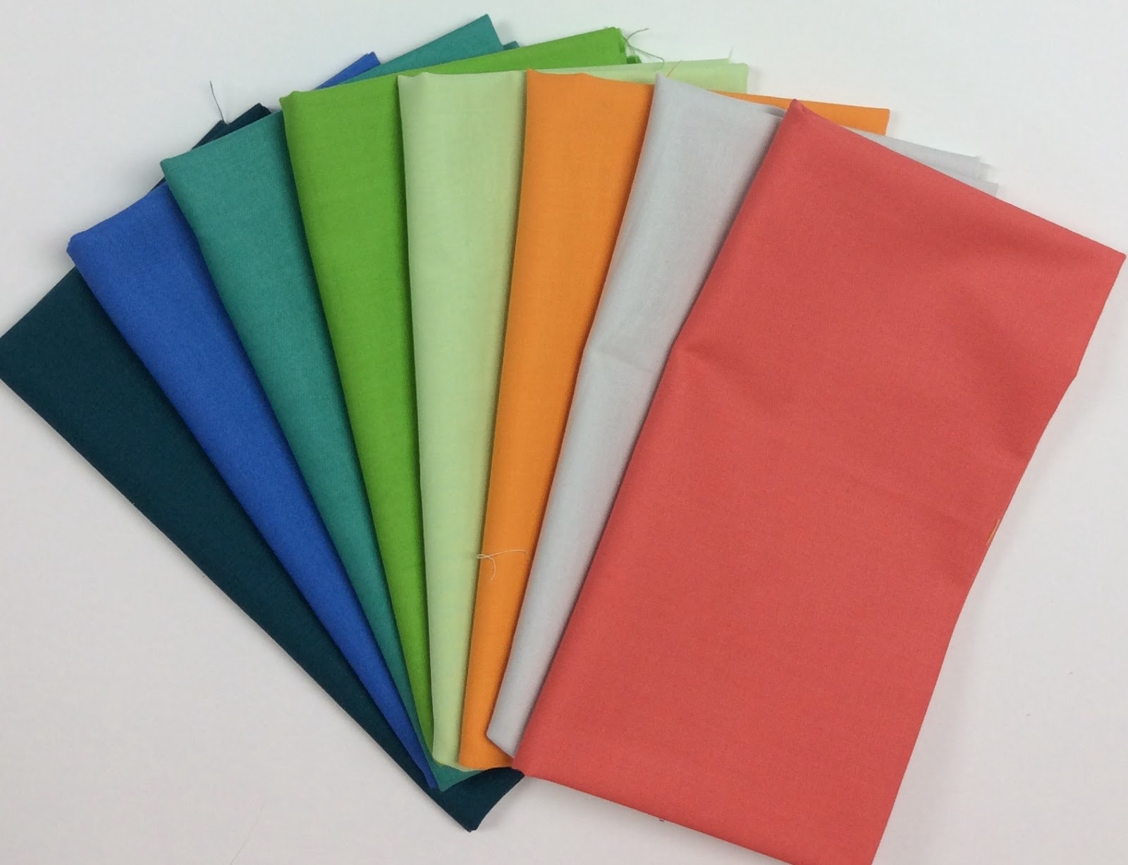
Carnival
"Carnival is a spring fresh array of solid colors that
are so sweet you can almost taste them. Cotton candy, snow cones, and
ferris wheels all evoke fun memories and this combo is reminiscent of the
colors found at those spring festivals. Ombre shades of pinks and
purples paired with light shades of green and blue are balanced out with a
silvery grey to create the Carnival palette."
 |
| Fabrics (from left): 121-016 Pale Silver, 121-073 Sangria, 121-078 Bubble Gum, 121-069 Carnation, 121-076 Apple Green, 121-040 Bright Aqua, 121-029 Lavender, 121-080 Amethyst |
Graphic Brilliance
"I chose the range of colors in my bundle for
a number of reasons. First, I knew my bundle would include black and white.
When designing these are always staples that I believe enhance the design and
also when placing color against them it allows the color to appear even more
true and vibrant. The next color selected was Amethyst due to purple being my
favorite color and Amethyst being my birthstone. The other colors selected are
colors I believe compliment the Amethyst directly and work well with each
other. They are bright bold colors that fit my artistic and modern aesthetic."
 |
| Fabrics (from left): 121-004 Ebony, 121-000 White, 121-054 Tangerine, 121-080 Amethyst, 121-067 Christmas Red, 121-013 Teal, 121-076 Apple Green, 121-003 Pencil Yellow |
Steel City Spring Bundle
"I chose these solids because these are my favorite spring colors. I also chose a variety of blues and grays to make the colors pop. There is a lot of rain in Pittsburgh in the spring, and I love the colors of the flowers against the steely sky."
 |
| Fabrics (from top): 121-049 Coral, 121-003 Pencil Yellow, 121-071 Green Sheen, 121-061 Wasabi, 121-019 Lapis, 121-022 Haze, 121-090 Smoke, 121-026 Navy |
Fire and Ice
"I chose this bundle because it plays of some of my favorite
colors (oranges and pink) against cerulean blues and yellow greens. The three closely matched neutrals are a calm palette and a great background trio to mix."
 |
| Fabrics (from top): 121-059 Bronze, 121-053 Paprika, 121-073 Sangria, 121-077 Moss, 121-050 Cadet, 121-011 Mist, 121-016 Pale Silver, 121-010 Silver |
Springtime Ombres
"This pink and blue ombre bundle is a great
addition to any fabric stash. Use them together or separate to create a fun,
colorful quilt. The sky is the limit!"
 |
| Fabrics (from left): 121-073 Sangria, 121-079 Raspberry, 121-068 Rosebud, 121-078 Bubble Gum, 121-37 Daydream, 121-025 River, 121-019 Lapis, 121-008 Royal |
Sanctuary
"Every summer we work with sea turtles on
Anna Maria Island off the Florida coast. This grouping of fabrics reminds me of
the beaches, sea and skies on that beautiful island."
 |
| Fabrics (from left): 121-013 Teal, 121-025 River, 121-039 Jade, 121-076 Apple Green, 121-072 Honey Dew, 121-054 Tangerine, 121-011 Mist, 121-066 Lipstick |
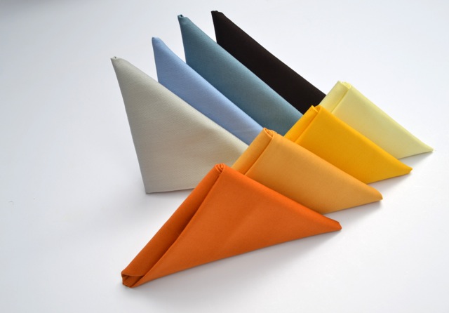
Wild Dandelion
"I've always thought of dandelions as the
first show of spring. From golden golds to bright yellows, they command
attention! This bundle was inspired by dandelions against the evening sky
at dusk. Dusky spring evenings are plain and simply…magical!"
 |
Fabrics (from left, front row): 121-059 Bronze, 121-058 Gold, 121-003 Pencil Yellow, 121-063 Citrus, (from left, back row) 121-016 Pale Silver, 121-037 Daydream, 121-022 Haze, 121-015 Mahogany
|
Tropical
Storm
"After a long winter, I was ready for some
bright colors! I paired warm sunset colors with tropical water blues then added
two greys for balance. It reminds me of sipping umbrella drinks on the beach
during a tropical storm."
 |
Fabrics (from left): 121-013 Teal, 121-039 Jade, 121-058 Gold, 121-054 Tangerine, 121-068 Rosebud, 121-028 Red Violet, 121-090 Smoke, 121-011 Mist
|
Gibson
"The old Gibson guitar factory is located in
Kalamazoo, Mi, where I live. I was inside the building at my daughter’s
tryout for the Kalamazoo Academy of Rock. Behind her were some windows
that had some peeling paint on them. They were large, factory-style windows. I loved the colors and design of the windows, so I took a photo. This
color palette is based on the colors of that window. I plan to make a
quilt based on the window design and colors!"
 |
| Fabrics (from left): 121-011 Mist, 121-016 Pale Silver, 121-010 Silver, 121-041 Taupe, 121-020 Sky,
121-022 Haze, 121-050 Cadet, 121-014 Grey |
Ocean Waves
"I
started to chose my palette by selecting some fabrics in a range of from light
to dark in my favorite color, blue. To add a little interest, I added in some of
greens and really liked how they popped against the blues. The palette is
is very calming and reminds me of the gentle tide of the ocean, hence the name
Ocean Waves."
 |
Fabrics (from left): 121-000 White, 121-072 Honeydew, 121-076 Apple Green, 121-034 Hunter, 121-020 Sky, 121-031 Turquoise, 121-049 Cadet, 121-001 Midnight
|
Banff National Park
"I am naturally drawn to a color palette that
includes blues and greens. Think cool waters. A lake. And the clear, blue sky.
The yellow adds contrast. Think of the warmth of the sunlight and new spring
growth. The white and grey additions provide depth. Think of rocky mountains
and fluffy, lazy clouds. Picture perfect. Nature."
 |
| Fabrics (from top): 121-000 White, 121-005 Bright Yellow, 121-061 Wasabi, 121-062 Pale Aqua, 121-040 Bright Aqua, 121-016 Pale Silver, 121-010 Silver, 121-014 Grey
|
Popsicle Stand
"I chose this bright,
fun palette because it reminds me of summer fun, the playfulness of childhood
and of course, Popsicles!"
 |
| Fabrics (from top): 121-027 Purple, 121-040 Bright Aqua, 121-025 River, 121-076 Apple Green, 121-016 Pale Silver, 121-005 Bright Yellow, 121-054 Tangerine, 121-066 Lipstick |
Elite Eight
"I chose some saturated colors that 'play well together,' along with a couple of calming neutrals. While I'm not sure any of these colors are part of actual team jerseys, only the best colors make it to the Elite Eight of a fabric competition."
 |
| Fabric (top row): 121-014 Grey, 121-011 Mist, 121-073 Sangria, 121-061 Wasabi, (bottom row): 121-030 Bordeaux, 121-039 Jade, 121-054 Tangerine, 121-060
Sulfur
|
Bittersweet
"My inspiration for this palette is driven off
of my desire to constantly challenge myself. Pink is not a color that I
gravitate towards, however it happens to be my daughter's favorite color. I
chose some of the pink tones that were just a bit off or "dusty." Then I then added my favorite color black, so that there could be a bit of her
and me represented together. To allow myself some flexibility in the palette I
added the light medium and dark values in each color."
 |
| Fabrics (from top):121-047 Shell, 121-073 Sangria, 121-028 Red Violet, 121-030 Bordeaux, 121-091 Snow, 121-011 Mist, 121-090 Smoke, 121-004 Ebony
|
Pop of Orchid
"I'm obsessed with the color wild orchid this year. I can't get it off my mind. I love it most when it appears as a pop of color where you least expect it. So although this palette is comprised of my usual favorites - aqua, teal, blue and gray, the orchid leaps out and demands attention, breathing life into what otherwise would be just an ordinary collection of analogous hues."
 |
Fabrics (from left): 121-010 Silver, 121-020 Sky, 121-000 White, 121-013 Teal, 121-024 Orchid, 121-076 Apple Green, 121-062 Pale Aqua, 121-072 Honeydew
Celestial Lights
"My original inspiration for this palette was to create an ombre bundle, because I have a love for transparency designs and piecing. As I was creating the palette, the touch of Sangria really modified the grouping for me and made me think about the gorgeous Aurora Borealis that can be seen from space."
|
 |
Fabrics (from left): 121-073 Sangria, 121-008 Royal, 121-038 China Blue, 121-040 Bright Aqua, 121-000 White, 121-029 Lavender, 121-027 Purple, 121-080 Amethyst
|
These designers are all on Instagram, so you can see their bundles and follow them to watch what they do with their eight solids. (Follow us on Instagram by clicking on the link in the right hand sidebar.) All of the voting will happen here on the blog--we'll be posting two "games" per weekday for voting, by you, our Inspired by Fabric friends, both old and new.
Voting is now live! Click on the "Home" tab at the top to find the current games.
Besides the fact that it's fun, why should you vote for your favorite? The designer of the "Best Bundle" will receive 1-yard cuts of their bundle, and we'll randomly draw two voters from the Championship game to also receive cuts of the winning bundle. So vote for your favorite and you just might win some for yourself! (And good luck choosing...all of these bundles are gorgeous!)
See the entire 84-color selection of Painter's Palette Solids here.
Thanks for playing along with our Mad for Solids Bracket!