Wednesday, July 31, 2013

Feels like summer: Calypso!

Some quilts you look at just make you happy, simple as that. Michele Crawford's "Calypso," featured in the August-September issue of The Quilter magazine, is definitely one of those. She mixed two large focal prints from the Calypso Frogs collection by Ro Gregg with a white tonal and Marblehead Brights framing each block. 

"Calypso" by Michele Crawford;
featured in the August-September issue of The Quilter magazine
Q. Why did you choose the Calypso Frogs fabrics, and how did you decide which fabric to feature as the focal print?
Michele: I thought that the bright leaves print in the collection looked very summery, so I chose the leaves on blue and the leaves on white as the focal prints. I am a very symmetrical person and liked the leaves on blue as the border print better than the leaves on white.


Q. Favorite fabric in the collection?
Michele: I like the leaves on blue best.

Q. Talk about the fabrics you paired with the main Calypso Frogs prints.
Michele: I used six different tonals from Marblehead and Marblehead Brights that would pull out the colors in the two focal fabrics as well as a white tonal for contrast.

Q. Tell us how you designed the block.
Michele: I played around with design ideas after being inspired by some modern quilts on Pinterest which featured bright colors with white.

Q. We love the flange! Why did you decide to add it?
Michele: This is a 3/8" finished dimensional border to add a little bit of zing, color and contrast to the quilt between the blocks, white border and outer border.

Q. What is your favorite part of the quilt?
Michele: I love the overall feeling of the quilt with its bright summer colors. People have told me that it is a happy quilt and makes them smile.

Q. How was the quilt machine quilted?
Michele: I like to machine quilt the quilt in the ditch in the seams between all the blocks and borders before I send it to my machine quilter, Kay Kimball, to "set" the quilt and to keep all the blocks and borders straight. Kay did what I call the "fancy stitching" with her Gamill and Statler. I needed her machine quilting to be simple so she quilted four hearts which make a flower in the center of each block and then a "loopy" stitch in the border. 

Find the kit for this project and learn more about Michele here.
See the entire Calypso Frogs collection here.
Find The Quilter magazine here.


Tuesday, July 30, 2013

Just Something About It...

Every so often, you see a quilt pattern that grabs you. It just works, and works well. You can't stop thinking about it, and you add it to your to-do list.

We'd like to offer up the free pattern for one such quilt, called "Summer Breeze." Designed by Pine Tree Country Quilts, this quilt mixes in just the right amount of white space in a simple, yet contemporary design. It's like a tall, cool glass of water.

What makes a great pattern even better? Matching it up with that just-right fabric collection. 

The blues and pink/purples of the Summer Breeze collection are so refreshing and cool. And that outer border? Pure genius. Can't you just imagine this quilt draped over a porch swing? Perfect for a cool summer night.

Find the Summer Breeze collection and the free Summer Breeze pattern here

Friday, July 26, 2013

In Alignment


Typically when we do a post on a magazine project featuring our fabric, we show you the project first and the magazine cover toward the end. 
Today we're showing the cover first, and we think you'll quickly see why.


Hello, cover quilt! 
Tony Jacobson's quilt, "In Alignment," pairs the richly colored prints of our Fall Tapestry collection with a solid white to create a graphic, easy quilt that really pops. Tony spoke to us about his modern fall design.

"In Alignment" by Tony Jacobson;
featured in the Fall 2013 issue of Easy Quilts

Q. What attracted you to the Fall Tapestry collection?
Tony: The patterns in the fabric line reminded me of the colors and patterns used by Gustav Klimt in his oil paintings.
Art by Gustav Klimt; Image: Klimt.com

Q. Why did you decide to pair the prints with white?
Tony: There is a lot of pattern in the fabrics so I wanted to give the eye somewhere to rest. Even though I was going for a fall looking quilt, I wanted to make sure it didn't get too dark, and the white fabric kept a brightness to the quilt that helps accentuate the colors in the print fabrics.

Q. This is such a great pattern to highlight a focal print. Was that what you originally had in mind when you designed it?
Tony: Yes, I thought the patterns were interesting on their own and wanted to highlight them in the quilt.

Q. Is there a print in the collection that particularly grabbed you? 
Tony: The orange circle print has a lot of movement in it which really appealed to me.


Q.  Can you talk about your decision process to add the stripe as a middle border?
Tony: Whenever possible, I like to let the fabric do the work. The stripe gives the border a pieced look without having to do a lot of intricate piecing.


Q. What do you like best about the pattern?
Tony: I really like to design quilts that are easy to piece but look complicated. I think this quilt is a good example of that. This was truly a quilt that I did from start to finish in a single weekend.

Q. Tell us about the machine quilting.
Tony: I machine quilted this quilt myself. I've been teaching myself to longarm over the last year. The quilt motif in this project is a "floral" pattern that I designed, which I create using oval quilting rulers to arc from the corners of each block to the center. It is an easy pattern to do and I've gotten to the point where I can achieve this effect fairly quickly without much marking.


See the entire Fall Tapestry collection here.
Find the kit for this quilt here.
Find the Fall 2013 issue of Easy Quilts here.


Wednesday, July 24, 2013

Under the Sea

We are extremely excited to show you Heidi Pridemore's new collection, "Under the Sea." It features the whimsical look that has made Heidi such a popular designer, and we're thrilled to have her working with us. "Under the Sea" includes two panels--an underwater scene and a porthole scene that can be cut into blocks--and a variety of brightly colored coordinates. 


Q. What made you choose an underwater theme?
Heidi: I had designed a fish quilt called "I'm Outta Here" back in 2004 and it is still one of our most popular selling patterns. I have added two more patterns to our pattern line over the years and always wanted to move the characters from the quilt patterns to a fabric line.


"I'm Outta Here"

"One Fish, Two Fish"

"Under the Sea"

Q. How did you choose the palette?
Heidi: My fish are very happy little guys and I wanted to use “happy colors.” I settled on a primary color palette so the line would appeal to both boys and girls of all ages.

Q. You are well known for your cute designs—talk to us about your style.
Heidi: My whimsical style is my original style. I see the world in big bold shapes and everyone has the potential to look cute. My designs seem to reflect my outlook on life. I like to create art that makes people smile.

Q. Which is your favorite print in the collection?
Heidi: My favorite print is the Porthole Panel. This is the first print my husband and I collaborated on and I think came out very well. I love the ideas that you can have a panel with circular windows that can easily be cut apart into 8” squares for simple assembly.

Q. What do you envision the line being used for?
Heidi: I see lots and lots of fun simple quilts for kids and adults. You can use the theme for a nursery or a bathroom. It would also be cute for beach bags or children’s apparel. Even an umbrella would be fun.

Q. What was your favorite part about designing Under the Sea?
Heidi: It would have to be two things: First, to finally see this line of fabric come to life after thinking about it for years is very exciting. Second, designing this with my husband and partner, Matthew. This was the first fabric line we worked on together. We usually do our own things and to see what happens when we worked together was also very exciting.

Q. How did you and Matthew work together on the line—who did what?
Heidi: I did the character sketches by hand and discussed fabric layouts with him. He took my artwork and created the digital files, added color and texture, and created the portholes for the fish. We collaborated on what elements to add to the fabric as we went along in the design process.

See the entire collection here and then ask for it at your local quilt shop!
Learn more about Heidi here.


Monday, July 22, 2013

Tutorial: Wonky Star Table Topper

Have you ever made wonky stars? If you like the idea but haven't tried it, we've got the tutorial for you! Dawn Stewart of Spring Water Designs is here today, sharing her tutorial for a summery red, white and blue table topper for your picnic table featuring fun, wonky stars. 
They're simple to make, and addicting, too!
After you've read through Dawn's tutorial, be sure to visit her blog to see how you can enter to win a giveaway of these red and blue fabrics to make your own runner!


Hi!  I'm Dawn Stewart visiting from Spring Water Designs and I've been having a good time playing with these beautiful reds and blues from the Roses are Red and Indigo Blues fabric collections from Fabri-Quilt! Plus a little white thrown in :)

I've been feeling really patriotic this summer because I've been taking part in the Stitching History project where a group of stitchers sponsored by the Maryland Historical Society have set out this summer to recreate the original  30 foot by 42 foot (hand stitched) Star Spangled Banner to mark the 200th anniversary of it's making.  (You can get some information and progress updates on my blog.)

So I decided to take these somewhat traditional prints and use them to make a Summer Celebration Table Topper with happy little modern wonky stars! It measures approximately 21" x 36".

Here are the fabrics that you'll need:
1/4 yard each from assorted Reds & Blues (I used 7 reds & 7 blues)
      From these cut: (24) 3-1/2" red squares, and (24) 3-1/2" blue squares
                                (12) 3-1/2" red squares cut in half diagonally = (24) red triangles
                                (16) 3-1/2" blue squares cut in half diagonally = (32) blue triangles
1/2 yard white
      From the white cut: (63) 2-1/2" squares
                                      (2) 2" x 18-1/2" strips
                                      (2) 3-1/2" x 9-1/2" rectangles
1/2 yard red for binding
1 yard large print red for backing

Now, let's make some happy little stars!  These will each measure 6-1/2" before sewing them into our table topper.  First, make one star with all red print star points.

Position a red print triangle right sides together with a 2-1/2" white background square, so that when stitched and pressed out the red will cover one corner of the white background square.  Change the angle slightly on each one to create the wonky effect.  Sew using a 1/4" seam allowance.

 Then press them out over the corner that they will cover...

Turn them over to expose the entire white background square and cut away the excess red fabric that extends beyond the white background square.

 See how from the front side all the star points are different and wonky ~ this random look is what we're going for. (Optional: You can choose to trim away the white background fabric that lays behind the red star points to eliminate bulk.)

Sew four more red triangles in the same manner as before to a neighboring corner on each unit.  Overlap each one differently for the wonky look.  Again press and trim just like before.

 Arrange the pieces and sew together in rows much like a nine patch block to complete the star.

 Next make two stars that have all blue star points...

Then make four that have red and blue alternating star points.

To create the center of the table topper, sew the two blue stars to either side of the red star.  Then sew a 2" white strip to the top and bottom.

Next lay two red and two blue 3-1/2" squares right sides together over the 3-1/2" x 9-1/2" white rectangles.  Draw a diagonal line from corner to corner on the back of the colored squares as shown above.

 Sew on the drawn lines and then trim away leaving approx. a 1/4" seam allowance.

 Press the colored corners out.

 Sew the red cornered unit to the left side of the star center and the blue unit to the right side.

Next you'll create the pieced borders by arranging the remaining red and blue 3-1/2" squares alternating red and blue as shown above.  (When piecing the blocks, I pressed all toward the blue blocks to help the seam allowances to nest nicely.)

Make two long borders that are 8 squares wide by 2 high, and two end borders that are 2 squares wide by 3 high.  Sew the pieced long borders to the top and bottom of the center, pressing toward the borders.  Then sew the four red/blue star units to each end of the two pieced shorter end border units, again pressing toward the borders.  Then sew these to the ends of your table runner.

Layer with a thin batting and the backing fabric and quilt together.  Bind with red.


I hope you enjoy your Summer Celebration Table Runner!
Enjoy the day!
~ Dawn

Be sure to head over to Dawn's blog to see how you can enter to win a fat quarter bundle of red and blue fabrics like she used!

Thursday, July 18, 2013

Whoooo's Watching?

Judy Hansen's new collection, Nite Owls, just came in and we couldn't wait to share it with you!


Last fall, Judy designed Cook's Helper (more on that below). How did she get from cakes and sprinkles to hooting owls?

With a little help from the talented Mr. Van Gogh.
''I love the stars and swirls in the sky of Van Gogh's painting, Starry Night,'' Judy says. She created her own swirls and stars, added a moon, and then thought, ''What goes better with a night sky than a night owl?"


And the rest was history.
(Or is that hoot-story?)


''Nite Owls'' comes in both color and black and white—we mixed the two below to show you how the pop of color can add some great contrast to the spooky black and white. (Halloween quilt, anyone?) 

Black and white prints with a few color coordinates thrown in 

The full range of prints in color
Find Judy Hansen's free quilt pattern, "Peek-a-boo Nite Owl," featured on our website.


***********************************************************************************

With summer in full swing, it's the perfect time to do some simple sewing and no-bake cooking with kids (keep them busy while they're out of school!)
We mentioned Judy's Cook's Helper fabrics earlier--there's a panel apron sized for children, and a print that features easy recipes like root beer floats, ants on a log, and purple cows.

 Click here to see more of the collection and read about how Judy's days as a preschool teacher inspired the prints.

You can find the Nite Owl and Cook's Helper fabrics, as well as more information about Judy, on her website.

Tuesday, July 16, 2013

It's time to vote!

American Patchwork & Quilting's One Million Pillowcase Challenge has passed the halfway mark! 
Stop and think about that for a second--more than 500,000 pillowcases have been stitched and donated to charity through this initiative. That's impressive. 

During the month of July, AP&Q is holding a contest on Pinterest. They've picked 20 of their favorite pillowcases and pinned them. The pillowcase with the most repins at the end of the month will be declared the winner and featured in a special hop. We are proud to be a sponsor of the Pillowcase Challenge, and we'll be participating in the hop in August.

How can you be part of this? Head over to their Pinterest page and repin your favorite pillowcase. 
(And keep reading below to be part of our contest here!)

By the way, did we mention that TWO of our pillowcases made it into the top 20? That's right! We wouldn't want to sway your vote or anything, but we did want to show them off:

Calypso by Ro Gregg


Lady in Red by Ro Gregg


We'd also encourage you to make a pillowcase (or more!) to donate. It's a quick and easy project, and you can make a difference for someone in your own community. You can find a huge variety of pillowcase patterns (including for all the pillowcases you see on this blog page) here.

In the meantime, we're holding our own contest right here, just for fun. Below you'll see all of our pillowcase samples from the Pillowcase Challenge from 2012 and 2013 (photos courtesy of American Patchwork & Quilting). Which one do you like best? And why? Leave us a comment letting us know!
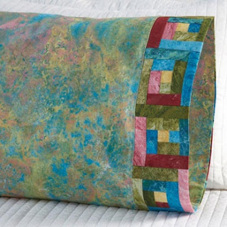
Log cabin pattern using Marblehead 
Uneven hourglass pattern using Fall Tapestry

Churn dash pattern using Garden Whimsy

Cottage in the forest applique pattern using Garden Whimsy

Crazy rail fence pattern using Pretty in Pink

Snowball pattern using Marblehead Pleasing Pastels

Precut strips pattern using Focus


Train pattern using Calypso Frogs

Chevron band pattern using Tribal Council

Spools pattern using Lady in Red

X block band pattern using Flutter

Bubbles applique pattern featuring Calypso

Rick rack pattern using Cambridge Flannel