Friday, January 17, 2014

Batiks in Action

Recently we shared fabrics from our new batik collection, and today we're sharing patterns you can use with these fabrics. Here are a few fantastic patterns available at quiltwoman.com:

Marble Pools by Ann Anderson; pattern available at quiltwoman.com


Pick Up Sticks by Lisa Walton; pattern available at quiltwoman.com

Adalynn's Garden by Elisa Wilson; pattern available at quiltwoman.com


Bermuda Sunrise by Linda Hahn; pattern available at quiltwoman.com

The possibilities for using batiks are pretty much endless, but we've also pinned some more of our favorites over on Pinterest. Check out our "Inspired by Batiks" board here.
What pattern would you love to see made in batiks?

Thursday, January 16, 2014

Meet Ollie


Meet Ollie, Heidi Pridemore's favorite Octopus! 
Inspired by her Under the Sea fabric collection, Heidi designed this lap size throw for The Quilter magazine, and today she's hear to tell us about it.
"Ollie Octopus" designed by Heidi Pridemore and machine quilted by Doris Pridemore;
featured in The Quilter February/March 2014
Q. What made you decide to do an octopus applique?
Heidi: I designed the Octopus for our fabric Under The Sea and he was my favorite character, so I wanted to showcase him. I made him overlap the pieced portion of the quilt because I like to extend appliqués across borders to break up the grid of the background and soften the edges.  
 
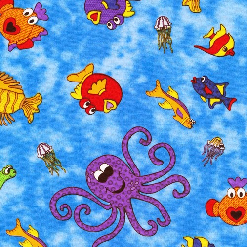
Ollie appears in Heidi's Under the Sea fabric
Q. How did you decide on fabric placement?
Heidi: I like to use the cooler colors for the larger areas and add a splash of the warmer colors in the blocks. 

Q. Love the use of that wiggly stripe for the binding! Did you design that fabric with bindings/borders in mind?
Heidi: Yes, I like using stripes on my quilts and don’t always like to fussy cut the stripe to be straight. So I designed a wavy strip to make it easier to use. 
No need to worry about straight stripes with this wiggle!

Q. How did you choose the two alternating blocks used in this quilt?
Heidi: I like to mix and match blocks in my quilts. I always look for the relationship between the blocks and any secondary pattern it will create when selecting blocks for a quilt.

Q. What do you like best about this quilt?
Heidi: I love Ollie, he just makes me smile and hope he does that for others as well!

Q. Any tips for appliqueing the octopus?
Heidi: When applying the octopus to the background, start at the head and gently push the tentacles down with your fingers to make sure they are positioned in the correct place before pressing them down. 

See the entire Under the Sea collection here.
See more of Heidi's work and purchase the kit to make Ollie Octopus here.
Find The Quilter magazine here. 

Tuesday, January 14, 2014

Bring on the color!

It's that time of year when most of us could use an infusion of color. Vibrant, soul-warming hues that make you smile.
Here you go!


That's right! We are now offering batiks. Are you a batik lover? It's hard not to be!

We have 75 glorious choices, ready to inspire your next project. Above is just a sampling of what's available; you can see the entire batik collection here. Be sure to ask for them at your local quilt shop. 

Friday, January 10, 2014

Romance for Two


With the Christmas season over, Valentine's Day is the next  holiday on the calendar. Get started now on this red and white table topper from the February/March issue of The Quilter, and when February 14th rolls around, you'll be ready! Let this quilt set the scene for a night of chocolate, wine and cupids, either for a romantic night with your special someone or chick flicks with your favorite girlfriends.
"Red Rose" designed by Diane Arganbright and Patricia Sue Nelson;
pieced by Patricia Meek and quilted by Shawna Crawford;
pattern featured in The Quilter magazine February/March 2014

Diane and Patty Sue of The Quilting Hen talked about their decadent red and white table topper design:

Q. What attracted you to the Roses are Red collection?
Patty Sue: Red and pink are my two favorite colors.  It is a rare find to have so many beautiful, complimentary shades of these two colors together in one collection.  And who doesn’t love roses?


Q. What’s the challenge/advantage of working with a single color collection like this?
Diane and Patty Sue: The challenge is placing the fabrics in the project so that they maintain their distinct values and do not mush together too much.
The advantage is that you can use all the pieces from the collection without the project becoming too busy or too overloaded with color.

Q. Looking at the first block—it's got such great detail with the pieced ''frame.'' What made you decide to do that as opposed to just using one fabric?
Diane and Patty Sue: We felt that the alternating light/dark strips made a simple block more interesting without adding too much difficulty.  It also gave us the opportunity to incorporate more of the fabrics into the project.

Q. Tell us about your border choices What prompted you to use four borders?
Diane and Patty Sue: We did not set out with four borders in mind. We simply kept working with different options until the quilt seemed complete.  We also liked the optical illusion that four borders give this quilt.  By designing it the way that we did, the finished quilt appears to be a rectangle, but is actually a square.

Q. Can you talk about the second block design?
Diane and Patty Sue: We wanted to choose a block design that would showcase the large floral rose piece without cutting it up too much and without simply using a large square or triangle in the quilt.  Since we were also thinking of Valentine’s Day when we were designing this project, the block design seemed to be perfect.  It reminded us of the shaft of an arrow, and by placing the blocks in the four strategic places, they appear to be pointing to the center, even without tips.

Q. What do you envision this quilt being used for?
Diane and Patty Sue: This quilt was definitely designed for holiday use.  We see it on a table or at an angle on the back of a davenport or recliner to add festivity.  It is large enough to be used as a picnic or lap blanket by a couple wanting to spend some quality time together.

Q. Can you talk about the quilting that was done on it?
Diane and Patty Sue: Patricia Meek did a fabulous job of piecing this quilt for us.  Her perfectly matched seams keep even the most difficult points sharp.  Her strict attention to proper pressing kept any seam from being visible under the white or light fabric. 
With a flawlessly pieced top, it was easy for our long arm quilter, Shawna Crawford, to create a fabulous design on this project.  Her unique, original quilting design complemented the vision we had for this project.  The flowing swirls and feathers provide a feeling of carefree gaiety.  The unending string of circles in the pink border is reminiscent of the circle of love.

Find a post about the Roses are Red fabrics here and see the entire collection here.
Find the kit for the Red Rose table topper here.
Find The Quilter magazine here.

Wednesday, January 8, 2014

Thinking Tropical?

With so much of the country plunged into chilly arctic temperatures, we thought we'd warm things up a bit by sharing Coral Sea, an underwater collection.

The prints come in black and white for a unique take on sea life, as well as jewel-tone colors. Seaweed, realistic-looking fish, seashells...this line has everything ocean lovers would want!


Terry Albers designed this free pattern, Seaquarium, using a variation of the classic Attic Window design. It's your very own quilted aquarium--great for highlighting these ocean-themed focal prints!
Terry designed the quilt using the black and white prints, but it would look great in color, too!

Find the free pattern here and ask for Coral Sea at your local quilt shop!

Monday, January 6, 2014

A Visit to Italy

Have you seen Ro Gregg's latest collection, Venetian Glass? 

23 prints of decadent deliciousness.


We asked Ro to tell us about the inspiration behind these gorgeous prints, and she explained that she'd been inspired by the art and color she'd seen on a recent trip to Italy. 
Capri, Italy

She hasn't said yes yet, but we're trying to figure out how to pack ourselves in her suitcase for a future trip!


Q. Tell us about your trip to Italy.
Ro: I went to Italy with my college roommate—it was both of our birthdays, and this was the trip of a lifetime! We toured the Amalfi coast and saw Venetian glass everywhere. Beautiful glass patterns and windows all over, filled with incredible color direction. I knew I could use this as inspiration for a fabric line, so I took a ton of photos. One shop I went into had some amazing vases, and I loved the multidimensional look they had.


Q. What else inspired you?
Ro: The focal print in this line has a pieced look, and it represents glass-blown globes. I also used the idea of Italian watercolor paper, which has so much movement in it. We also toured this amazing house-turned museum, Villa San Michele on Capri Island. The marbles in it were phenomenal. So much in Europe is scroll and lattice design, and I wanted to combine what I saw in the museum with the Venetian glass concept. I love how it came out.
Italian watercolor paper print


Villa San Michele--so much marble!
Q. How did you develop your colorways?
Ro: The first color palette is influenced by a trend called Under the Sea: Bright blues, turquoise and greens, with some purple. The next is the really hot colors, some of which I saw on my trip (see photos below): Corals, marina blue, tangelo orange. The third color way takes its influence from the global bright colors: Sunshine yellow, brilliant reds, bright greens, and cobalt blues. 
 
Corals, marina blue, tangelo orange

One in each color, please!

Q. What's your favorite print in the collection?
Ro: The focal print, which has a hand-pieced look. It reminds me of the blown glass balls. I do really love the scroll designs as well.


Q. What do you think is unique about this collection?
Ro: It mixes in geometric with classic—the swirls have a mod look, and then the scrolls and lattice are more traditional. I like the motion of it all, and I think the color palettes are something special.

Which print is your favorite?
See the entire collection here and ask for it in your local quilt shop. 
Stay tuned; we'll be showing some quilt designs featuring these prints!

Thursday, January 2, 2014

Happy New Year!

Wishing you a happy and healthy new year, 
filled with plenty of inspiration, new fabrics, and sewing fun! 
We're looking forward to another year of sharing just those things with you!

Do you make new year's resolutions? 
If so, what's one resolution that you've made for the new year?