It's a new week of Mad for Solids voting! Find out more about our bracket here.
Today we're featuring two games. Look at the bundles and choose your favorite for each game. Leave a comment below with your picks for both games. Please list the bundle name and the name of the bundle creator, as we have several duplicate names and want to make sure your vote counts. Please vote only once per game. Voting for these two games is open from 12 pm CST on 4/4 through 11:59 am CST on 4/5.
Voting for these games is now closed!
Game 1:
Gibson vs. Ocean Waves
Choose your favorite and leave a comment below with the name of the bundle and the name of the bundle creator.
Gibson
"The old Gibson guitar factory is located in Kalamazoo, Mi, where I live. I was inside the building at my daughter’s tryout for the Kalamazoo Academy of Rock. Behind her were some windows that had some peeling paint on them. They were large, factory-style windows. I loved the colors and design of the windows, so I took a photo. This color palette is based on the colors of that window. I plan to make a quilt based on the window design and colors!"
 |
| Fabrics (from left): 121-011 Mist, 121-016 Pale Silver, 121-010 Silver, 121-041 Taupe, 121-020 Sky, 121-022 Haze, 121-050 Cadet, 121-014 Grey |
vs.
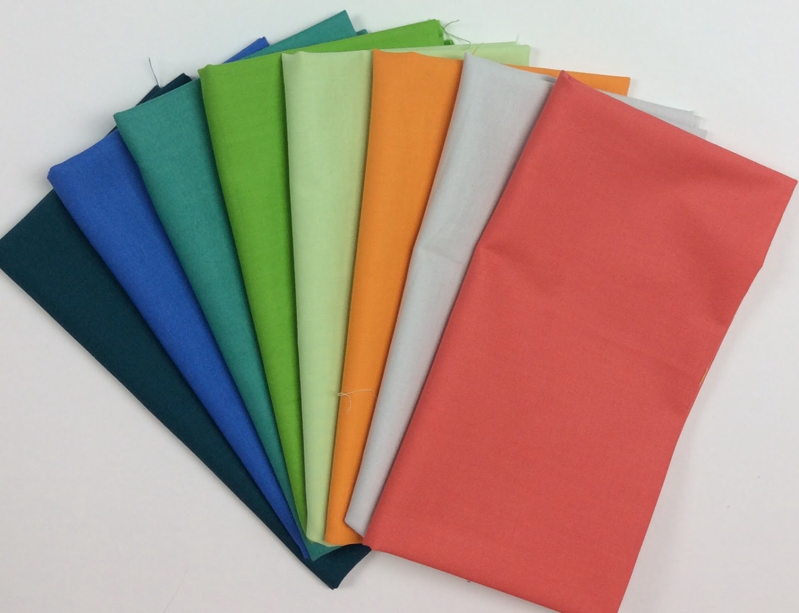
Ocean Waves
"I started to chose my palette by selecting some fabrics in a range of from light to dark in my favorite color, blue. To add a little interest, I added in some of greens and really liked how they popped against the blues. The palette is is very calming and reminds me of the gentle tide of the ocean, hence the name Ocean Waves."
 |
Fabrics (from left): 121-000 White, 121-072 Honeydew, 121-076 Apple Green, 121-034 Hunter, 121-020 Sky, 121-031 Turquoise, 121-049 Cadet, 121-001 Midnight
|
Game 2:
Banff National Park vs. Popsicle Stand
Choose your favorite and leave a comment below with the name of the bundle and the name of the bundle creator.
Banff National Park
"I am naturally drawn to a color palette that includes blues and greens. Think cool waters. A lake. And the clear, blue sky. The yellow adds contrast. Think of the warmth of the sunlight and new spring growth. The white and grey additions provide depth. Think of rocky mountains and fluffy, lazy clouds. Picture perfect. Nature."
 |
| Fabrics (from top): 121-000 White, 121-005 Bright Yellow, 121-061 Wasabi, 121-062 Pale Aqua, 121-040 Bright Aqua, 121-016 Pale Silver, 121-010 Silver, 121-014 Grey |
vs.
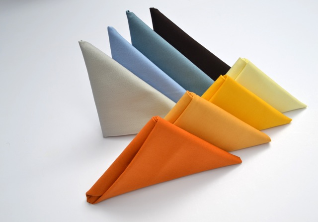
Popsicle Stand
"I chose this bright, fun palette because it reminds me of summer fun, the playfulness of childhood and of course, Popsicles!"
 |
| Fabrics (from top): 121-027 Purple, 121-040 Bright Aqua, 121-025 River, 121-076 Apple Green, 121-016 Pale Silver, 121-005 Bright Yellow, 121-054 Tangerine, 121-066 Lipstick |
See the entire 84-color selection of Painter's Palette Solids here.
Thanks for playing along with our Mad for Solids Bracket!