Showing posts with label Quilt magazine. Show all posts

Thursday, September 12, 2013

Do you Dresden?


Tammy Silvers used the monochromatic Roses are Red collection to create a Dresden beauty with a vintage feel. Gorgeous!  The pattern for this quilt is featured in the October-November issue of Quilt magazine.
"Roses are Red" by Tammy Silvers 

Q. Why did you decide to make a Dresden Plate design?  
Tammy: Even though the prints are obviously floral, reds and pinks remind me of little hard candies - so I decided to embrace that impression and combine it with a traditional dresden plate block. I think dresden plates are fun to work with, especially these with the pointed tips.  Once you get past cutting the templates (and using a great template ruler designed for them, such as Creative Grids' Dresden Plate ruler), it is smooth sailing.  And while it is a plate—a circle, you're actually stitching straight lines.  How cool is that?

Q. Can you talk about the on-point layout you used?
Tammy: The dark red narrow sashing frames each block and lets each one shine.  AND it has the added benefit of making the quilt easier to construct! Sashing and cornerstone blocks help quilts keep blocks straight.  Have you ever put a quilt together and when you get done, realize that it "tilts" to one side?  I certainly have - proof that every fraction of an inch off really does add up!

Q. What is your preferred appliqué method and why?
Tammy: While this quilt LOOKS very traditional, and it certainly can be made traditionally, I tend to favor methods that speed things up.  I fused the blocks on with narrow strips of fusible (set in a large "block" format, leaving the tips free); the edge stitching was a blanket stitch, which is definitely a favorite of mine, and done just around the center.  The blocks would be charming with blanket stitch around each blade.  I certainly hope that if someone does do blanket stitch around each block, they will share pictures with us.  I would love to see that!

Q. What attracted you to the Roses are Red fabric line?
Tammy: This is a terrific line, in that it has a great range of tints and shades of the red family AND it is a nice variety of print scale and type.  There are some nice geometric style prints, and the florals run from small tone on tone to large-scale prints.


Q. What are the advantages and challenges of working with fabrics that are all one color?
Tammy: A monochromatic quilt can be quite dynamic - or it can be very boring.  The challenge is achieving variety through contrast.  It's an excellent opportunity to work on contrast - you will definitely understand when you're through that between your light (white, for example) and your dark (black, for example), the tints and shades of grey in between draw their contrast and place in the color scale from their partner - the other fabric you pair it with.  If you're pulling together reds from your stash, or from a quilt shop's shelves (even better, right?), you do have to make sure they play nicely together.  When working with fabrics from a single collection (like these luscious Roses are Red prints), that issue has already been resolved for you. They are designed to play together!

Q. With a red and white quilt we have to ask: did you worry about color bleeding?
Tammy: Pre-wash!  Did I?  Ha - I'm too impatient for that!  So I'll have to treat this quilt with kid gloves.  But I should have.  And even after pre-washing, with a high contrast quilt such as this, I would still test my fabrics to make sure all excess dyes have been removed. Pre-washing is always a good idea.

See the entire Roses are Red fabric collection here.
Find the kit for this project here.
Learn more about Tammy here.
Find Quilt magazine here. 

Wednesday, June 26, 2013

How to use a focal print as background


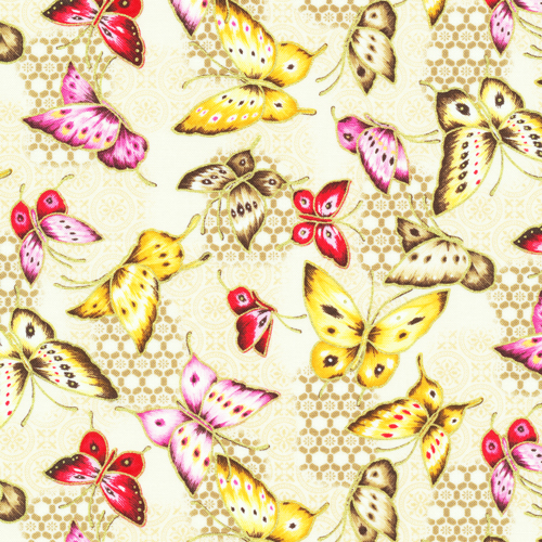
When Cathy Miles created her "Asian Garden" quilt (using our fabric line of the same name), she chose to highlight the coordinating tonal prints, reserving one of the allover prints (butterflies!) for the background of the pieced blocks. 
"Asian Garden" by Cathy Miles;
featured in Quilt magazine, August-September 2013 issue

We love the result! What do you think? 
Read what Cathy has to say about her quilt design, which reminds her of Chinese lanterns.

Q. What attracted you to the Asian Garden fabrics?
Cathy: There is good contrast between the various fabrics, and I seem to be drawn to designs that have a definite light/medium/dark palette so the design of the blocks really shows. But really, butterflies! Who can resist?


Q. What are the two blocks you used, and why did you decide to pair them?
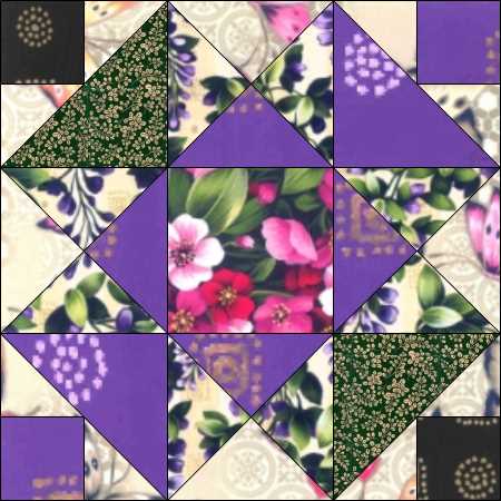
Cathy: The mostly purple one is Aunt Dinah and the pink one is Lucky Clover. I like the strong chain effect that surfaces when the blocks are alternated. I experimented with different ways to use the fabrics, but the final one reminded me of strings of Chinese lanterns.

Aunt Dinah block

Lucky Clover block

Q. Why did you decide to make the pink, green and purple prominent in the design?
Cathy: Green and purple has been a favorite duo of mine for years, it reminds me of spring with lilacs, pansies, hyacinths, all those great blossoms that tell us spring is here. Adding the pink in this one made a riot of color that played well with the background butterflies.

Q. How do you think that busier design of the butterfly print in the background enhances the quilt?
Cathy: I think the print used as background softens the effect of the strong colors.

Q. What do you like best about the quilt?
Cathy: This one turned into a more personal design than expected. We visited Butchart Gardens (located in Brentwood Bay, British Columbia) and the nearby butterfly garden with my parents several years ago, and I was reminded of the masses of flowers and beautiful Vancouver with hanging baskets along the sidewalks.

Q. Were there challenges to designing/making this quilt?
Cathy: Trying to achieve a good balance with strong colors was a challenge. I wanted to avoid having one color dominate the quilt.

Q. What do you enjoy most about quilting? 
Cathy: I have such great fun with quilting! If my 'play' has become 'work,' it is all good. 
My husband has also been very helpful and supportive of my projects, so it is fun for both of us. He is involved with hanging quilt shows and taking care of the racks, which was a big job last year when there was a fire in the storage area. He hand sanded every piece because he knew it was important to eliminate any possibility of soot staining the quilts or having a quilt show that smelled like smoke. He always finds someone to chat with as we visit various shops. I think he has been surprised at the number of men he meets who also support their wives in various ways.

Find the kit for "Asian Garden" here.
See the entire Asian Garden fabric collection here.
Find Quilt magazine here. 


Thursday, May 2, 2013

Rouge Royale

What's fun about a red, black and white fabric collection? Seeing all the different ways people use this classic color combination. We've seen Ro Gregg's Lady in Red collection showcased in our free pattern, the two-color blogging design ring tutorial, and School Girls in Red, among others.

Today, we have "Rouge Royale," a nine-patch star block set on point that merges traditional with shabby chic. Designed by Tammy Silvers and Julia LaBauve of Outside the Lines Design and machine quilted by Pat Yearwood of Stitch 'n Quilt, this beauty is featured in the current issue of Quilt magazine.

"Rouge Royale" by Tammy Silvers & Julia LaBauve;
featured in Quilt magazine June-July 2013


Q. What attracted you to the Lady in Red fabric collection?
Tammy: I love bright color, and strong contrasts, and this line offers both, combined with a wonderful vintage-feeling floral, which immediately attracted the "shabby chic" side in me.

Q. How did you come up with the design for this quilt?
Tammy: I wanted the wonderful soft florals to take center stage, so I looked for blocks that echoed the traditional feel of the motifs, in a scale that would allow for the fabric patterns to shine. I also like to contrast organic shapes (the florals) with strong linear designs (the blocks). I think this creates a tension that is interesting.

Q. Tell us about the pieced setting and corner triangles. They really enhance the design.
Tammy: Aw, shucks - thanks so much! The blocks for this quilt are quite large (20" square). Without a pieced setting and corner triangle, even the large blocks would have been lost in plain fabric setting and corner triangles. But.....the piecing in those setting squares didn't need to compete with the center blocks. I think that the simple piecing, which echoes the basic lines in the center blocks, sets a nice stage for the main blocks.

Q. How did you decide on the border treatments?
Tammy: I approach borders much like framing a picture - what will enhance the quilt center—the true star of the show—without detracting or dulling the quilt. Traditionally, the outermost border is the largest, but I think providing two narrow black borders (inner and outermost) allow me to use the terrific bright red overall rose print in a wide border, yet tone it down enough to keep it from overwhelming the quilt center.


Q. What is your favorite part of the quilt? 
Tammy: Ummm....difficult to say. Some quilts I create I honestly don't "love" until all the parts come together, and then it's like a terrific song - you can't image the lyrics without the melody. On this one - well, I really like the nine patch star block. But what I think is absolutely the best part is the linear "weave" of the white floral that is created between the blocks. There is something about setting a block on point that can elevate even the most "mundane" (if a quilt block can be called mundane - let's face it, even the humble four patch creates some fabulous quilts!) block to a new level. It's that change in perspective. I definitely love that!

Q. What can you tell us about the machine quilting choices?
Much as I would LOVE to take credit for all aspects of the quilt, I cannot take ANY credit for the quilting. Pat Yearwood does all my quilting and she does an outstanding job of choosing complimentary threads and quilting motifs to compliment my quilts. The only quilting I've mastered is the loopy loop - so thank goodness for Pat and her fabulous portfolio of quilt designs.

Learn more about Tammy here.
See the full Lady in Red collection here.
Find the kit for this quilt here.
Find Quilt magazine here.


Friday, March 8, 2013

Folk Heart Sawtooth Star Pattern

There's nothing we love more than seeing our fabrics in use! Earlier this week we shared a link on Facebook to a kit from North Beach Fabric, which uses a huge array of Marblehead prints in a gorgeous Judy Niemeyer pattern (click here if you missed it on Facebook!).

Today it's a link to Quilt magazine's Fabric Stash, a feature that shows new and old favorite blocks in current fabric lines. Debra Finan, the magazine's editor, used Folk Heart in a classic block design, the Sawtooth Star. 


Don't you love how the gold floral pops against the black and cream background? Imagine an entire quilt made of this block, switching out the star points with the red and green prints as well.

You can find the free pattern for this block here.

Have a great weekend!


Friday, December 28, 2012

Perfect Harmony (on the wall!)

Asian prints have a sophisticated elegance to them, and Ro Gregg's Dancing Cranes collection fits this description perfectly, highlighted with metallic gold accents. Designers Sue Harvey and Sandy Boobar of Pine Tree Country Quilts framed the collection's panel with a unique design of pieced blocks that integrate seamlessly--as Sue says, "we definitely do not do just plain borders around a panel!"

"Perfect Harmony" featured in the Feb-March issue of Quilt magazine


Q.  What attracted you to the fabric line?
Sue: We have always loved the lush florals of Oriental-style fabrics. And the panel in this collection is really beautiful.

Q. How did you decide what type of piecing to put around the panel?
Sue: We wanted the panel to become part of the piecing. Fortunately one of the fabrics in the collection is the same as the background of the panel so by using this fabric in the piecing directly around the panel, the straight edges of the panel disappear. By using rectangular blocks, we could accommodate the “twice as long as wide” problem of the panel while still adding distinctly angular lines to offset all the flowing lines of the panel and the outer border fabric.

Q. What do you like about working with Asian-inspired designs?
Sue: The rich colors of the fabrics, and that they almost always include black. We tend to use black to set off color or the design in many of our quilts. It’s the one basic fabric that we keep in stock (actually bolts of it in stock) at all times!

Q. What do you like best about this quilt?
Sue: When all was said and done....its size! We think it really does show off the fabric in a good way. The scale of the prints is fairly small and the motifs in the panel are quite delicate. The challenge of making a small quilt was a good thing. We had only enough room to add a little piecing so the prints of the fabric were not overwhelmed. It’s funny ... the designs we do with limits are often the ones that we end up liking the best!


See the entire Dancing Cranes collection here.
Order the kit for this project and learn more about Pine Tree Country Quilts here.
To find the February/March issue of Quilt, click here.


Tuesday, October 9, 2012

Get a Holiday Headstart!

...with this easy poinsettia table runner, featured in the December-January issue of Quilt magazine.


We spoke to Terry Albers of Hedgehog Quilts, who designed this table runner using the Noel collection. 

Q. What attracted you to the fabric line?
Terry: I love poinsettias...especially pink and creamy white ones.  I love the realism and the scale of the blooms. The gold metallic accents are gracefully done and give even more depth to the background. It was an irresistible combination for me.

Q. How did you come up with the idea for the table runner?
Terry: I wanted a small, quick project for gift giving. My quilting friends and I will be making several of these for church bazaars, charity auctions and, of course, one set for ourselves. It is an easy pattern...the fabric does most of the work.

Q. How did you choose the coordinating fabrics to go with the main
poinsettia print?
Terry: I chose the red and green tonals from the Noel collection and accented it with true, deep black.

Q. What is your favorite part about the table runner?
Terry: I think there is an elegance to flowers set on point, and I love that. 

Click here to learn more about Terry and her patterns. 
Click here to purchase the kit for this table runner from The Quilting Hen.
Click here to find out where you can purchase Quilt magazine.

Terry also sewed a set of matching napkins that fold into a tree (and you don't have to be a napkin-folding expert to do it!). How neat! Find the pattern for these napkins free here at quiltmag.com.