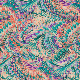
23 prints of decadent deliciousness.
We asked Ro to tell us about the inspiration behind these gorgeous prints, and she explained that she'd been inspired by the art and color she'd seen on a recent trip to Italy.
 |
| Capri, Italy |
She hasn't said yes yet, but we're trying to figure out how to pack ourselves in her suitcase for a future trip!
Q. Tell us about your trip to Italy.
Ro: I went to Italy with my college roommate—it was
both of our birthdays, and this was the trip of a lifetime! We toured the
Amalfi coast and saw Venetian glass everywhere. Beautiful glass patterns and
windows all over, filled with incredible color direction. I knew I could use
this as inspiration for a fabric line, so I took a ton of photos. One shop I
went into had some amazing vases, and I loved the multidimensional look they
had.
Q. What else inspired you?
Ro: The focal print in this line has a pieced look,
and it represents glass-blown globes. I also used the idea of Italian
watercolor paper, which has so much movement in it. We also toured this amazing
house-turned museum, Villa San Michele on Capri Island. The marbles in it were phenomenal. So much in Europe
is scroll and lattice design, and I wanted to combine what I saw in the museum
with the Venetian glass concept. I love how it came out.
 |
| Italian watercolor paper print |
Q. How did you develop your colorways?
Ro: The first color palette is influenced by a trend
called Under the Sea: Bright blues, turquoise and greens, with some purple. The
next is the really hot colors, some of which I saw on my trip (see photos below): Corals, marina blue, tangelo orange. The third
color way takes its influence from the global bright colors: Sunshine yellow,
brilliant reds, bright greens, and cobalt blues.
 |
| One in each color, please! |
Q. What's your favorite print in the collection?
Ro: The focal print, which has a hand-pieced look.
It reminds me of the blown glass balls. I do really love the scroll designs as
well.
Q. What do you think is unique about this
collection?
Ro: It mixes in geometric with classic—the swirls
have a mod look, and then the scrolls and lattice are more traditional. I like
the motion of it all, and I think the color palettes are something special.
Which print is your favorite?
See the entire collection here and ask for it in your local quilt shop.
Stay tuned; we'll be showing some quilt designs featuring these prints!


They are all gorgeous, so saturated with colours!
ReplyDeleteExcuse me. I need to wipe the drool off my chin........
ReplyDelete